Problem
Experience of moving to a new place is often inefficient and stressful due to disconnected tools and limited access to reliable resources. This is an opportunity to build a unified platform that supports users through planning the move, during the move and settling in.
Background
People move for many reasons—education, jobs, or better opportunities. But moving is not just physical. It’s emotionally, financially and mentally challenging.
Users often struggle with:
Managing multiple tasks at once
Adjusting to a new environment,
Handling unexpected costs and stress
Move Mate helps simplify the stressful process of moving by guiding users through every step, making relocation more organized and manageable.
Project:
Lifestyle & Relocation
Role:
Solo UX Researcher & Designer
Timeline:
12 weeks
Tools:
Figma, FigJam, Figma slides,
Figma make, Figma sites
Platform:
End To End Application
Final Result
Creating Task List of Relocation Stages
What does a user actually go through?

Before Moving
1.Feeling excited about a new beginning, but also anxious about the unknown.
2.Struggling to manage too many tasks across different categories.
3.Difficulty in prioritizing what to do first, leading to confusion.
4.Facing information overload from scattered and unreliable sources.

During Move
1.Trying to adjust to a completely new lifestyle and environment.
2.Feeling lost, homesick or unorganized.
3.No clear visibility of progress or completion of tasks.
4.Struggling to build a routine and find local resources.
5.Still dealing with leftover tasks and mental fatigue.
6.Worried about planning, budgeting, and unexpected challenges.

After Moving
1.Physically exhausted and mentally overwhelmed.
2.Managing logistics, travel and expenses all at once.
3.Feeling pressure due to poor time management and last-minute tasks.
4.Difficulty keeping track of what’s done and what’s pending.
5.Experiencing high stress due to lack of structure.
Persona

Affinity Map
After developing the persona, I conducted a card sorting exercise to identify how users naturally grouped information. This helped guide the design direction and ensured that key decisions aligned with both user needs and project goals.

Design Approach
By analyzing findings from interviews, affinity maps, and card sorting exercises, I uncovered common user needs and challenges. These insights helped shape a focused design approach and provided a clear path toward achieving the project goals.
Smart Checklists
Personalized, stage-based
checklists that adapt to user needs
and moving timelines.
Progress Tracking
Visual progress indicators that
show completion percentage and
motivate users.
Guided Journey
Step-by-step relocation guide that
breaks the process into
manageable stages.
Smart Move Advisor
Personalized tips and service
recommendations based on user
preferences.
POV
People relocating to a new place need early, official, and reliable guidance on essentials like housing, banking and transport because moving without clear support can lead to costly mistakes and overwhelming stress.
HMW
How might we design a calm, friendly, supportive pop-up that helps users to refocus when they start over-scrolling and redirects them back to their intended task gently?
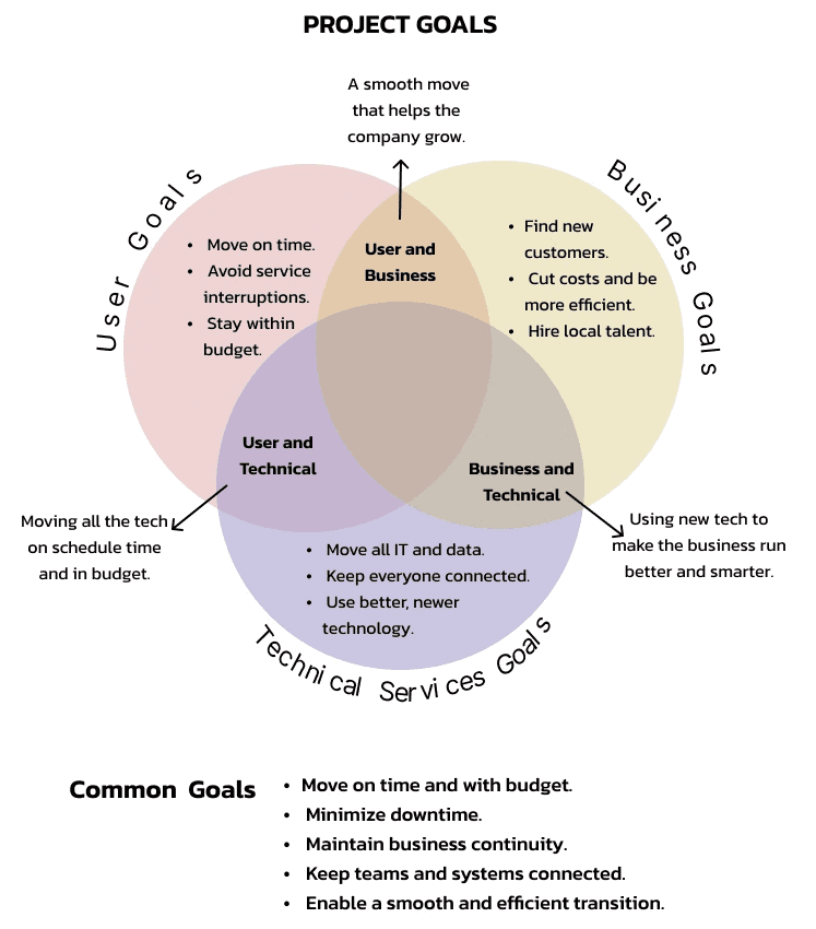
Project Goal
Research revealed a shared need across users, business stakeholders and technical teams: a seamless relocation experience that minimizes disruption, maintains connectivity, and supports business continuity.
Storyboard
This storyboard maps the user's relocation journey, from feeling overwhelmed to feeling more confident, and highlights where the product can provide guidance, organization and support.

User Flow
Participant interviews revealed that relocation is both an emotional and logistical challenge. I used a storyboard to visualize the user's journey from uncertainty to confidence and then created a user flow to map key actions and decision points. These insights guided design decisions focused on providing clear guidance, organization, and support throughout the relocation process.

Task Flow

Hand Sketches
The process began with hand sketches, where ideas could flow without limitations. These early explorations helped shape the direction of the product before translating them into more refined wireframes

Mid Fidelity
The transition from sketches to mid-fidelity wireframes brought clarity to the design, helping shape ideas into a structured and user-focused product experience.

Brand Value
Brand value represents the foundation of a relocation brand designed to simplify moving through trust, care and efficiency while supporting users during a major life transition.

To align with the project's purpose, I selected the most essential brand values and translated them into a color palette that reflects trust, care, and efficiency throughout the relocation journey.


UI Elements
Relocating is stressful, so I designed the UI to ease that anxiety. I chose a soothing color palette to reduce tension and created a progress wheel with tiny milestone boxes. As users move forward, these visuals show them how close they are to the finish line—turning a tiring process into a motivating, step-by-step journey

High Fidelity
I moved from mid-fidelity layouts to high-fidelity designs, tweaking and improving the screens at every step. This steady evolution made sure the interface was polished, functional, and fully ready for real user testing.

I tested the prototype with real users and learned what worked and what didn't. Using their feedback and experience, I made key changes to improve the design. The result is a much smoother and more user-friendly experience.
Iterations 1
User feedback showed a need for clearer guidance.
I simplified the content and improved visual hierarchy to help users easily understand and navigate each stage of their move.

Iterations 2
Usability testing showed that users struggled to compare packages and understand the payment process.
To make the experience clearer, I grouped package details, added a progress indicator and integrated payment into the same flow.
This helped users make decisions more easily and complete their purchase with confidence.

Iterations 3
Usability testing showed that users struggled to compare packages and understand the payment process.
To make the experience clearer, I grouped package details, added a progress indicator and integrated payment into the same flow.
This helped users make decisions more easily and complete their purchase with confidence.

I crafted the final screens to feel clean, professional, and deeply trustworthy. By organizing all pre-move tasks clearly on the screen, users can see exactly what needs to be done before moving day. This sense of preparation removes the guesswork, giving users total peace of mind and complete control over their journey

Impact
This project helped me understand the complex journey of relocation and how UX research can transform overwhelming experiences into manageable ones. The goal was not only to create a functional relocation app, but also to design a solution that feels helpful, personal, and supportive throughout every stage of moving—from planning and logistics to emotional adjustment and community integration.
I learned that good UX design for relocation is about giving users support while still letting them feel in control. Features like checklists, progress tracking, reminders and step-by-step guidance helped make the moving process feel easier and less stressful.
The research also showed that moving is not only about planning tasks . It is an emotional experience too.
This project taught me that user behavior is influenced by timing, motivation and emotions. Understanding different moving stages and user needs helped me design more empathetic solutions.
Overall, the project improved my understanding of user-centered UX design and how research can help solve real-life problems.
— Pooja P., USA
"Finally, an app that understands how
stressful moving is. The progress tracking
was incredibly motivating, and the interface
is beautiful."
—Neelam S, Europe